Our research journey for Dipbite Snacky began with an in-depth exploration of snack culture in Ghana and West Africa, tracing the roots of popular traditional snacks and their role in everyday life. We engaged with consumers, retailers, and internal stakeholders through immersive workshops, surveys, and interviews to uncover the authentic spirit of Dipbite Snacky. From this process, one clear insight emerged — “A taste of joy and authentic snack culture.”
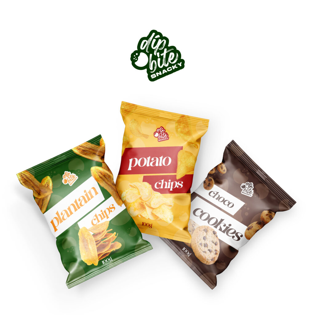
Dipbite Snacky is uniquely positioned as a vibrant, accessible brand that bridges tradition and modern snacking trends. The product range of plantain chips, potato chips, and choco cookies reflects an authentic Ghanaian snack heritage, updated for today's consumer seeking both quality and delight. The brand thrives on delivering happiness through every bite, making snacking a joyful, accessible experience for all.
Dipbite Snacky Logo Design
The Dipbite Snacky logo uses a hand-brushed script to convey warmth and a handcrafted feel, reflecting the brand’s authentic and joyful snacking experience. The bite mark symbol, featuring crumbs, visually represents taking a bite, adding a playful and memorable touch. The bold black outline ensures high visibility, while the clean, uppercase “SNACKY” balances the design and clarifies the product category. Overall, the logo captures the fun and flavourful essence of the brand in a simple, eye-catching way.
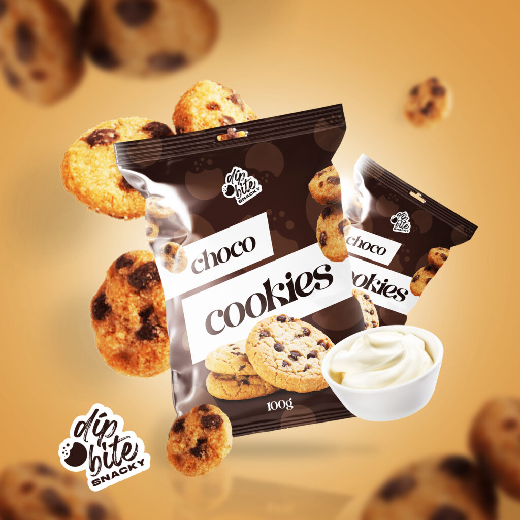
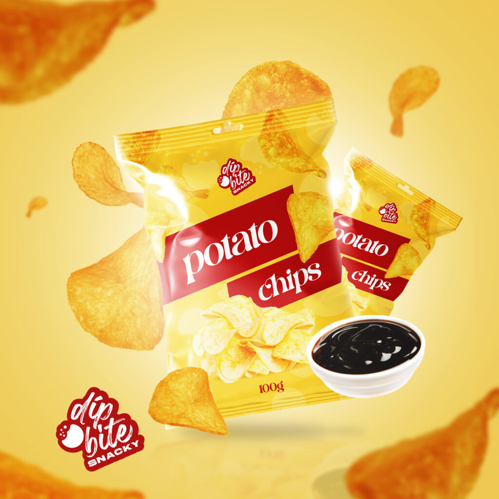
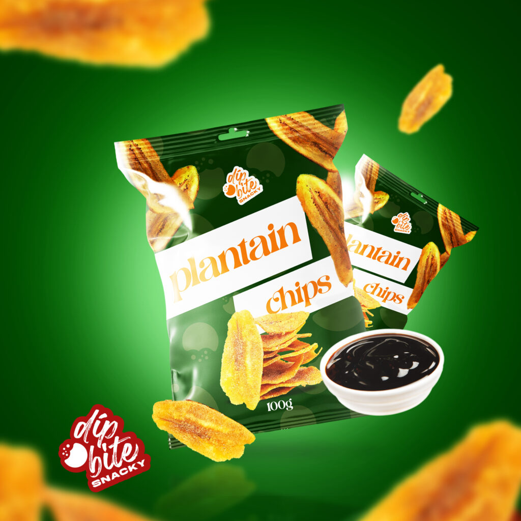
The Dipbite Snacky packaging uses vibrant, bold colours to attract attention and differentiate each product variant—plantain chips, potato chips, and choco cookies. Clean, modern typography and high-quality product imagery communicate freshness and flavour. The consistent placement of the logo and colour-coded backgrounds create a cohesive brand identity, making the snacks instantly recognisable on shelves. The playful, inviting design reflects the brand’s promise of joyful, authentic snacking moments.
Creating Delight and Connection Through Visual and Verbal Identity
The brand identity is crafted to express this joyful, authentic spirit. The visual language uses bold, inviting colours and dynamic packaging imagery to stimulate craving and convey freshness and quality. The playful typography and warm messaging ("You Should Try Us!" and "Snacking Your Way To Happyness") invite consumers to engage directly and feel a personal connection to the brand. These elements extend into all touchpoints, creating a cohesive narrative that encourages consumers to include Dipbite Snacky in their daily moments of happiness and togetherness.
Through consistent visual storytelling and emotional connection, Dipbite Snacky positions itself as more than just a snack — it is a companion in moments of joy and shared experience, rooted in authentic taste and modern delight.